

2018 Q2 Review - Fun Design
The second quarter of 2018 has various types of exhibitions, like tech exhibition COMPUTEX, first-time-in-Taipei APSAL, and APPPEXPO, Int’l Ad& Sign Exhibition, in Shanghai. We, King One Design, followed the principle of Customized Service, combining special structural design with bold color choice in response to the individuality of every company.
This time in Q2 review, we selected “Fun Design” as the theme. As mentioned, Customized Service has always been our strength and feature. From the beginning of the discussion, the process of the proposal to the end of design and construction, our service flow is based on the value of our clients. The only thing we want to do is just embody the ideas and value from our clients to build an outstanding exhibition booth.
Now, let’s take a look our specially-selected works from Q2, 2018!
Selection of Vibrant Colors
In front of you is a palette. Which color would you choose for a perfect exhibition booth? White, the safest and you-can’t-go-wrong color? Black, the introverted and professional color? Or Red, the most eye-catching color? Either of the choice from above is the best color because “Beauty is in the eye of the beholder.”
However, we need to put “symbolic meaning of colors” into consideration, too. A good selection could not only reflect the brand’s image but also make the booth stand out among all the others.
(Further study: Top Three Color Choices for Exhibition Design )
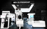
DFI, IT WEEK
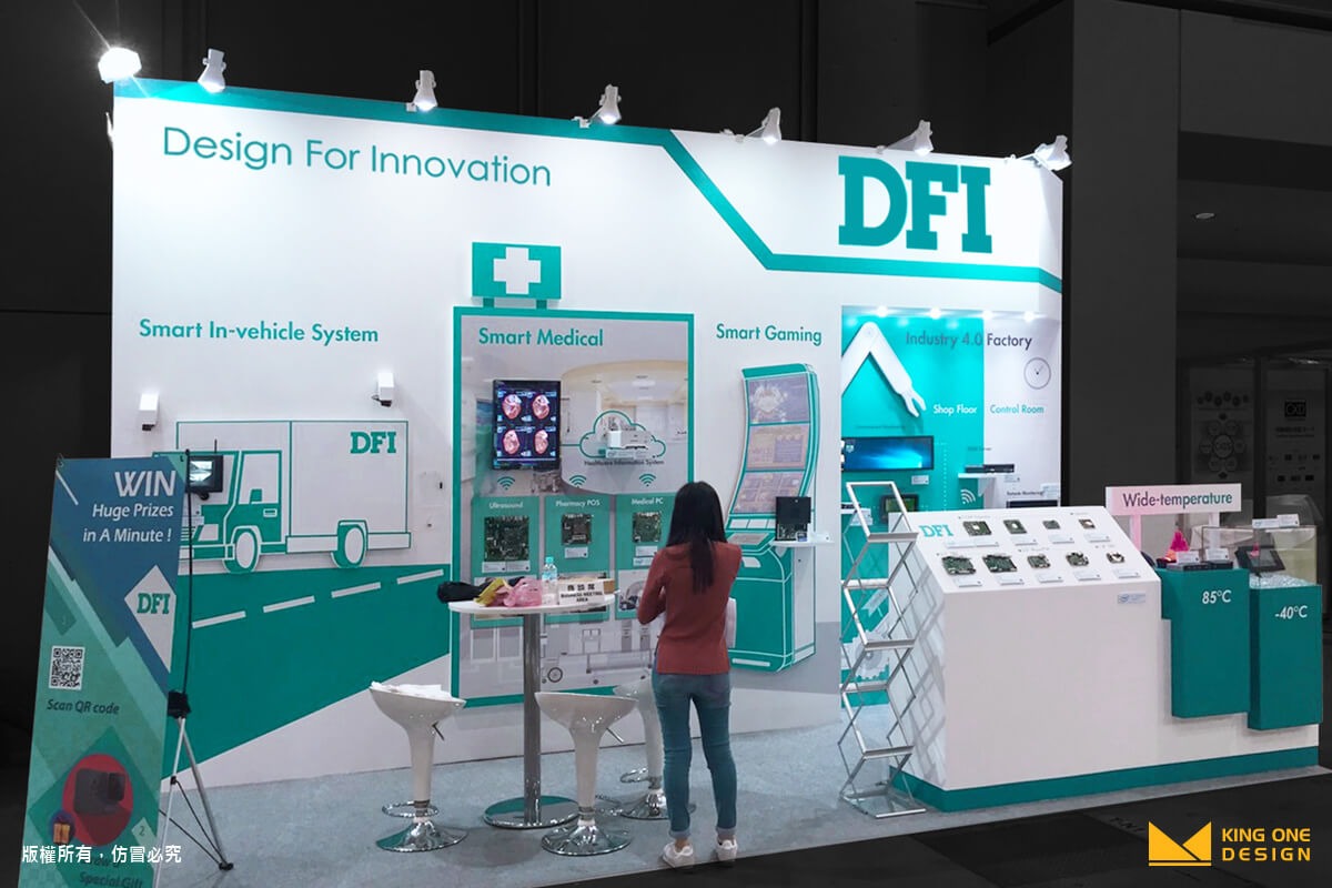
Simple design, easy success. Without an exaggerated hanging sign, DFI had a very simple peninsular stand. The highlight was the bold and brilliant color choice – Marine Green! With a touch of it, humanity was added to the booth and brought out the feature of smart the elements of the products.
ICPDAS, COMPUTEX
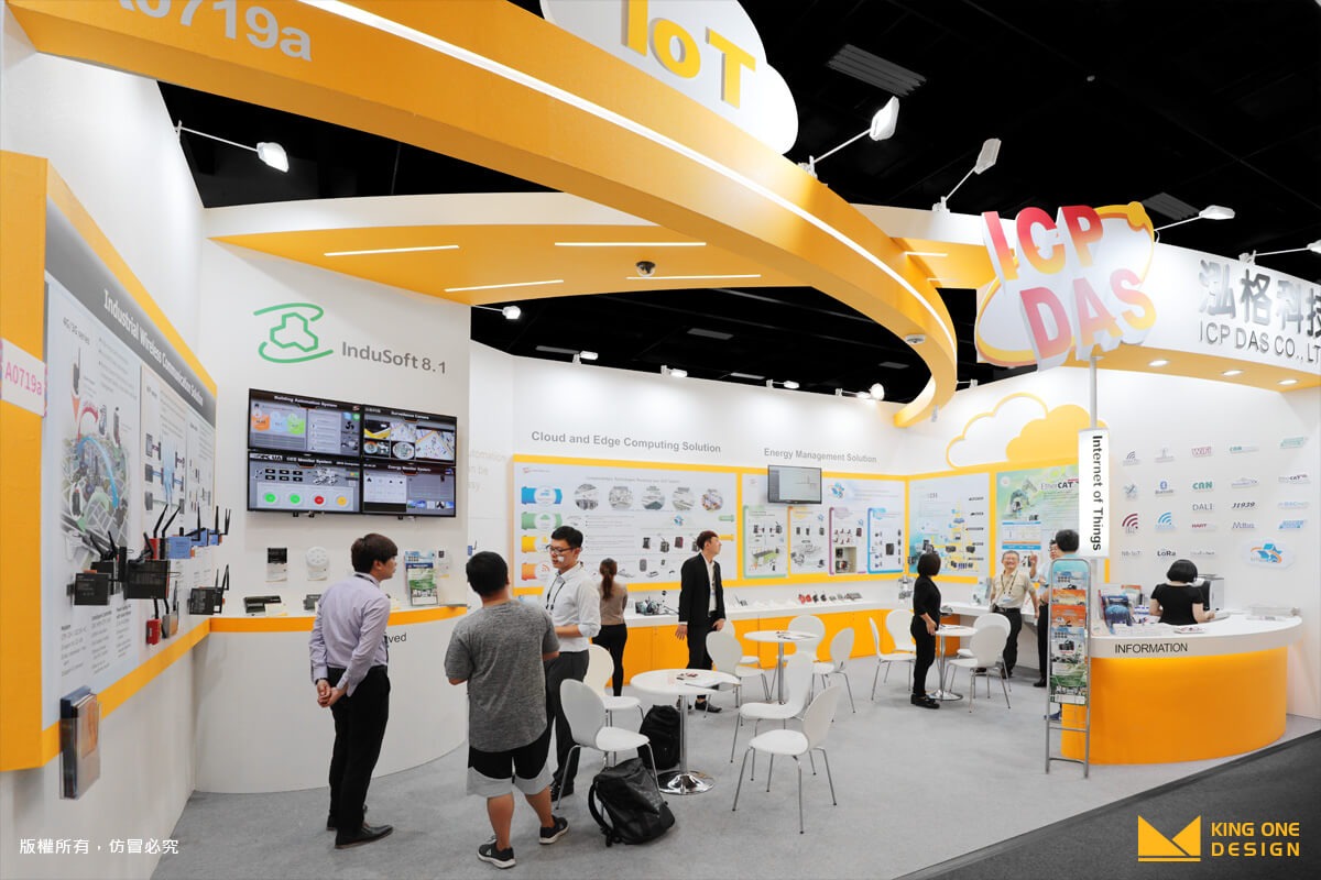
The restricted wall stand could not restrict the dynamic vitality. Unlike other technology company, ICPDAS chose the vibrant color of orange over white or black, resulting from the emphasis on family and recreation value. The use of color brought the warmth of human vitality.
AbbVie, APASL
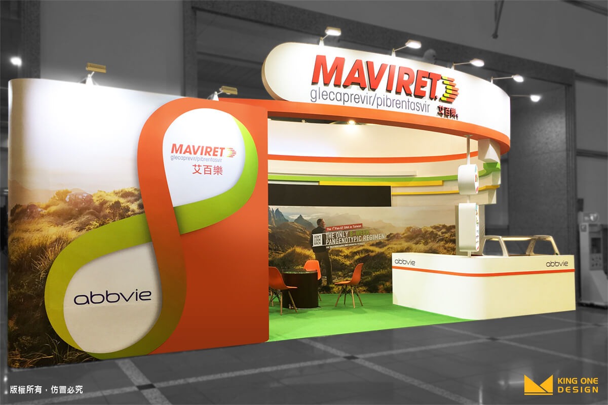
AbbVie, a newly-established Biopharmaceutical company, owned the scene with its young strength. The contrast color of red and green, boldly-chosen, made the booth stand out; along with the symbol of “Infinity” as the key vision, AbbVie shared the idea of unlimited life circle, bringing the outstanding work to the attendees.
The Designs with WOW factor!
When it comes to a good design, yes, the color is important, but sometimes we also search for the WOW factor. It has a lot to do with fantastic and detail-oriented ideas. For instance, a two-floor height image column or a halo lighting banner are the best works from our Q2, 2018. Let’s have a look and wait for screaming “WOW!”
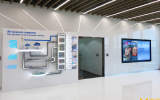
NANO, APPPEXPO
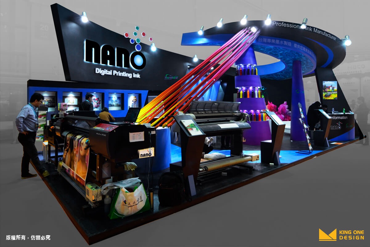
The booth of NANO was undoubtedly one of the most dazzling design in the second quarter of 2018. The image column is made of a very special material – ten stretches of four different types of fabric, connected from the top panel to the floor, striking up as the best banner. What’s more, the unique color of the fabric was printed with NANO ink, which totally spoke for NANO and shows the uniqueness and the strength.
ATEN, COMPUTEX
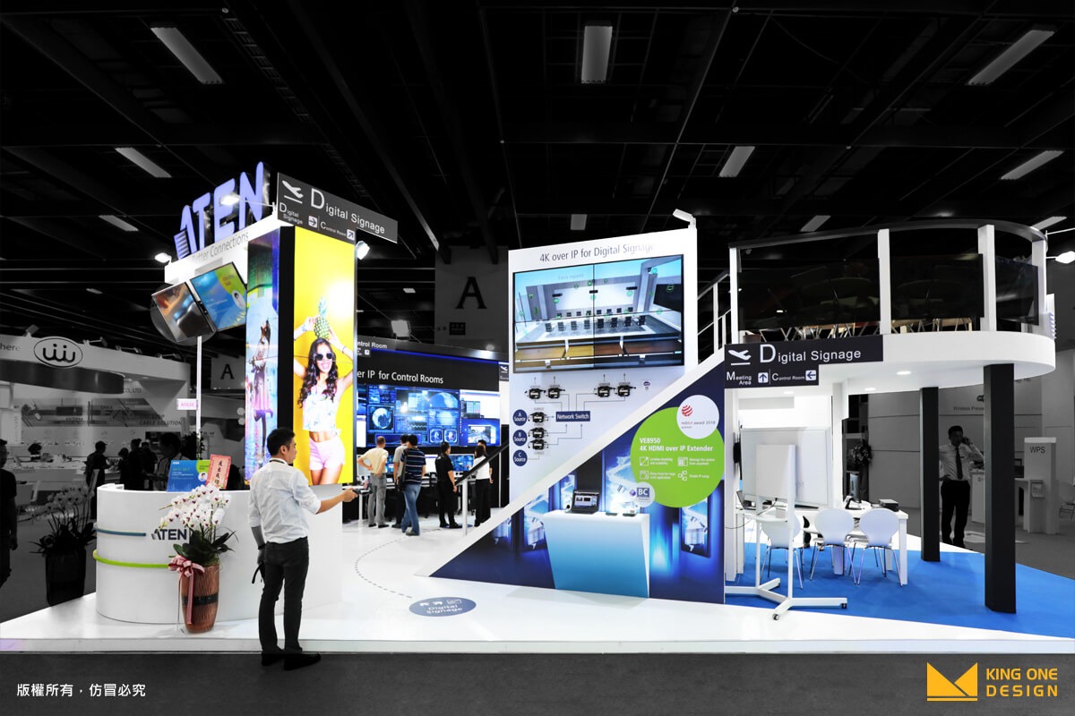
Usually, when we talk about booth design, we focus on the structure and stand style, but we rarely think about building a two-floor booth. But not for us! King One Design built a two-floor booth for ATEN. This was a situational airport with a broad and bright view; furthermore, you could go upstairs to the second floor to see the full view within one glimpse.
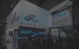
FSP, COMPUTEX
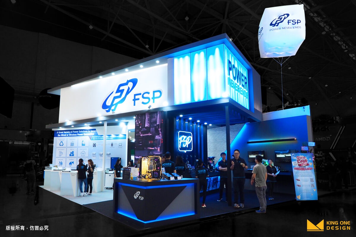
One floor is 3-meter high, but FSP has a 6-meter high banner! Not satisfied with an ordinary banner, FSP went with a BIG choice. The banner was up there on the second floor, to be precise, the whole second floor was the banner itself, making it visible to every attendee, even from far apart. To put the icing on the cake, we chose Halo Lighting, not the ordinary direct light, for the banner to show the humbleness.
Open Meeting Area Opens Up the Opportunity!
We have talked about a lot of interesting work of color choices and the structure design cases. Do we miss something — the meeting area! An exhibition is a place for the corporate to show their products and strength as the result in closing more business deal and of course, more money!
The meeting area is easily forgotten by the clients, but we can take care of it. Mainly, there are three types of meeting area, Open, Semi-Open, and Close. Either of them offers a good vibe for business discussion, but today, we are going to present the Open meeting area as our best examples in Q2, 2018.
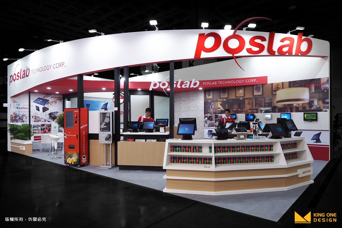
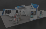
PosLab, COMPUTEX

AbbVie, APASL

ICPDAS, COMPUTEX
Dot-like setting in the open space is one of the best way to build an Open Meeting Area. In this way, the openness not only provided the convenience while exploring the booth, but also made a lighter vibe.
Besides, if the furniture could match the design style and theme, we could bring the advantages to the extreme and perfectly integrate the meeting area into booth design. Moreover, it could also lower the compressed and mervous vibe, and make the meeting more vibrant.
(Learn more about Meeting Are: [Exhibition 101] Intro of Meeting Area)
- 1
6 Different Types of Trade Show Booths You Need to Know
Brand Strategy
- 2
What is CIS? Corporate Identity Design that goes hand in hand with exhibition design
Tech Life & Trends
- 3
Five creative ways to enhance your booth appeal
Tech Life & Trends
- 4
Fly Your Own Airplane - AR Interactive Experience Activity with ANA Airlines
Digital Transformation
- 5
3D Logo - The Little Secret in Exhibition Design
Exclusive Perspective
- 6
6 Steps to Make Your Own Instagram Filter!
Digital Transformation